Did you ever need a little nudge, a little kick in the pants?.... A little pull, a little push, To rid yourself of "I can'ts?" Do you need to have your engine revved, Your tires pumped up with air, Your horn tooted by someone 'cept you?.... Well, Congratulations! You're there!...Cate
July 17, 2007
Bean Brainstorming
Eliza's friend Sarah spent the day with her today, and they wandered outside on the porch where I was breaking beans. They were fascinated with the beans and wanted to help. The beans with the strings are, I think, theirs. I was thoroughly entertained and the time flew by. They began holding them up and seeing what they reminded them of. It was fun. I enjoyed every minute of it.
The Beans That Started the Thing
Sarah thought this one looked like a crescent moon. Eliza turned it and made a moustache, then dropped it down into a frown, one more turn and she had a smile. I thought it looked like a clipping from the Green Giant's toenail.
s-s-s-s-snake in the beanpatch
Elvis impersonator
Beanie Baby
s-s-s-s-snake in the beanpatch
Elvis impersonator
Beanie Baby
More Beans
Casper the Friendly Bean
Unzipped Bean
Beanie Baby
I haven't got a clue on this one. The girls called it "C", but I think it has more potential than that. What do you think?
Unzipped Bean
Beanie Baby
I haven't got a clue on this one. The girls called it "C", but I think it has more potential than that. What do you think?
July 08, 2007
hee, hee, hee!

Timeout for Art, cover for my art journal. Somehow my Gnome got turned around in his corner, it was a classic Kodak moment. It made me think of all the timeouts I "endured" as a kid. Five minutes is for-ever. Acrylic paint spatters, decopodged music tissue, flower punches, doodling.

Bannie photo. I don't think you can see the glitter accents on the flowers. I cut the flowers from coordinating paper.

Wonky scan. Fatty buttons. One of my friends calls me "RG" or "Running Goddess" and another asked me what my superhero moniker is so I came up with "Death Girl Running Goddess" because my alter-ego is ever so goth : .) I hope I don't have to change it to something like "Aquajoggingdeathgirlpowerwaternymph" because that is a mouthful.
Aren't the tiny graphics (owl, heart, circle, apple) just too cute?! They're rub-ons.
Aren't the tiny graphics (owl, heart, circle, apple) just too cute?! They're rub-ons.


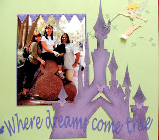
Disneyland 2007 layouts. They're 12X12 so I had to take pixs and crop (poorly) because I don't know how to stitch if I scanned 'em. The castle is the title page, the other two face each other. Yeah, I hand cut all the letters and the castle, which was lifted from a Euro-Disney Fantasyland pix on Google images. I had originally paper pieced Tink in a red outfit, to go with the color theme of the two facing pages, but I didn't like her expression. I ended up buying Jolee's Boutique stickers. I used chalk on the castle. The large Mickey icon heads are hand cut, the small ones on the castle are punched, as are the triangles & * The smallest icon heads are eyelets I bought @ Disneyland. The parens and the tiny titles in red/black/yellow are stickers.
I obviously can't decide what style I should follow, sloppy-grungy, cutesy, or graphic. I really like 'em all!!!
P.S. Ny - I tried doing the pastel challenge. I could only manage "brite" pastels.
July 03, 2007
Simple elegance
 This is the card I just made for the wedding we're going to this weekend. Quick and easy, but the best part is that I got to use the paper crafting tools I've been collecting lately. Like the Cuttlebug, which uses an embossing plate to create the blue background with the embossed flowers. And my 3" scallop punch. Scallops are totally trendy right now so I better get my usage out of it before they're out of style again. lol.
July 02, 2007
Skully Love and Coffee Beans Cha, Cha, Cha
Subscribe to:
Comments (Atom)


